Leads Reporting gives you visibility into every lead that reaches your clinic — however it arrives: web forms, phone calls, texts, faxes, referrals, and the leads Petey, your AI agent, manages. The dashboard is built to give you the high-level overview at a glance, then let you drill down by location, source, payer, owner, and more whenever you need to understand why a number is moving — not just that it moved.
Understanding the Metrics
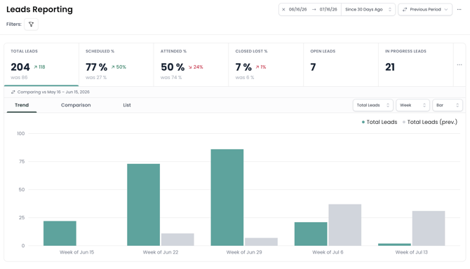
The cards across the top summarize your pipeline for the date range and filters you've selected. They're customizable — six show by default, and you can add or hide cards using the ... menu on the far right. Hover over any percentage card to see the exact counts behind it (for example, "42 of 150 leads").

The cards are clickable. Click any card to make it the active metric — the Trend, Comparison, and List views below all switch to show that metric, and the List scopes to those leads. It's how you go from a headline number to the story behind it, so start here whenever a number surprises you.
Shown by default:
- Total Leads: the total number of leads created in the selected window
- Scheduled %: of those leads, the share that booked an appointment
- Attended %: among leads whose first appointment has already come due (its scheduled time has passed), the share who actually attended. Because the denominator is appointments that should have happened by now — not every lead — this reads as an attendance (show) rate, and isn't dragged down by leads whose visit is still in the future
- Closed Lost %: the share of leads marked as lost (higher is worse, so this card is colored in reverse)
- Open Count: leads still active and in play right now — a live snapshot, not a windowed number, so it carries no comparison arrow
- In Progress Count: leads currently being worked, as of right now — also a live snapshot
Available to add:
- Closed Won %: of the leads in your window, the share marked as won (successfully converted) This relies on statuses being kept up to date and means something different at every practice. Scheduled % and Attended % come straight from appointment data and answer the two questions that matter: did the lead schedule an eval, and did they show up.
- Deleted %: the share of leads removed, measured against all leads (active + deleted) (higher is worse)
A note on the percentages and the arrows: each rate is measured against the leads in your window, so changing the date range or filters changes the group being measured and therefore the percentage. Each card also compares to your chosen comparison period: an up arrow means the number rose, down means it fell. For most metrics up is good, but for a few (Closed Lost %, Deleted %, and the timing metrics) up is worse, so those are colored the opposite way. Simple rule: green is always good news, whichever way the arrow points.
Available Filters
In addition to date filters, you can also filter by:
- Locations and Sites
- Benefits (if using Consumer Direct or Employer Direct)
- Payers
- Lead Source, Marketing Source, and UTM Tracking data (source, medium, campaign, term, content)
- Lead Owner and Referring Provider
- Lead status and Closed Lost reason or category
- Team and Scheduled By (when Petey is enabled)
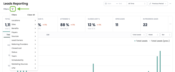
Every metric, chart, and view updates to match your filters. You can also use Export All to send yourself the underlying lead records and you'll be notified by email when the file is ready.
Three ways to view your data: Trend, Comparison & List
Most metrics can be viewed three ways. Switch between them using the tabs. To focus on a specific metric, click its summary card first and the views below will follow it.
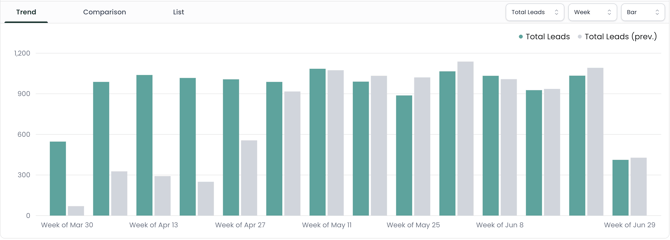
Trend
See a metric over time. Choose your granularity (day, week, month, quarter, or year) and chart style (area or bar). Best for spotting direction — are we improving or declining? The chart overlays your comparison period so you can read the two side by side.
Comparison
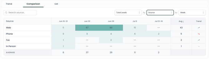
A shaded grid that breaks a metric down two ways at once. Pick what the rows represent (Location, Site, Source, Lead Owner, Payer, or a UTM dimension) and what the columns represent (a time period, or another dimension). Each cell is shaded by its value, so strong and weak spots jump out. Click any cell or row to drop straight into the List of those exact leads. This is the fastest way to answer "who or what is driving this?" — for example, which location has the highest Scheduled %, or which source is losing the most leads. To break results down by campaign, set the rows to a UTM dimension — see Understanding UTM Tracking to get your links tagged.
List
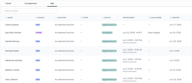
The leads themselves, in a searchable, pageable table with columns such as name, source, location, payer, and status. Click a lead to open it. The List respects all your filters, and when you click a Summary card or a Comparison cell, it auto-filters to match so you can always reach the underlying leads behind any number.
Velocity
You also can get a sense for how fast things move through the funnel at your practice using the following metrics:
- Time to First Touch: how long it takes a user to make an update to a newly-created lead, on average
- Time to First Visit: how long between the initial request and scheduled first visit, on average
- Time to Closed Won: how quickly successful conversions are occurring, on average
- Time to Closed Lost: how long between the initial request and a lost lead, on average

Lead Pipeline Flow
The Lead Pipeline Flow shows the average time a lead spends in each stage of your pipeline. The stages are your own configured lead statuses, laid out in lifecycle order (Open → In Progress → Closed).
- It's a single horizontal bar. Each segment is a stage, and the wider the segment, the longer leads sit in that stage on average.
- The "Avg total" badge sums the stages currently shown.
- Use the customize menu (...)to show or hide any stage. Your Closed Won and Closed Lost stages are hidden by default (a lead's time "in" a closed stage usually isn't all that helpful), but you can switch them on anytime.
Use this to spot bottlenecks: a wide stage early in the pipeline means leads are waiting there longer than you'd like.

Closed Lost Analysis
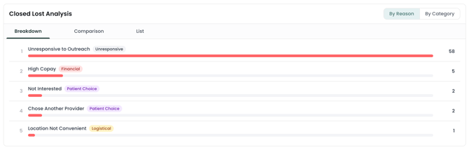
Closed Lost Analysis breaks down the leads you marked as lost, so you can see why.
- Group two ways: by Reason (the specific reason each lead was lost) or by Category (reasons rolled up into themes — Medical, Logistical, Patient Choice, Financial, Unresponsive, and Other).
- Three views: a Breakdown (ranked list, most common first, each with a bar and a count), a Comparison grid (crossing reasons/categories against a dimension like Location or Source), and a List of the lost leads themselves.
Use it to find patterns worth fixing: if one reason or category dominates, that's where to focus.